How to Read Trading Charts

What Is a Trading Chart?
Let’s kick things off with the basics—what exactly are trading charts? Trading charts are visual tools that display the price movement of assets like stocks or cryptocurrencies over time. These charts are essential in technical analysis because they provide a clear picture of how an asset’s price has fluctuated. Whether you’re looking at a stock or a crypto asset, trading charts help you track highs, lows, opening, and closing prices for any given period, from minutes to years. Understanding these charts is key to making informed decisions about buying or selling.
How Does a Trading Chart Work?
Trading charts work by plotting price data over time on a graph. The horizontal axis (x-axis) represents time, while the vertical axis (y-axis) shows the price. Each point on the chart represents how the price moved during a specific time frame—this could be anything from one minute to one day or more.
Here’s what you’ll see on a typical trading chart:
- Open Price: The price at which the asset began trading during the period.
- High Price: The peak price during that period.
- Low Price: The lowest price during that period.
- Close Price: The price at the end of the trading period.
By analyzing these points, traders can spot trends, assess market sentiment, and make predictions about future price movements. This is a fundamental aspect of technical analysis.
Fundamental Analysis vs. Technical Analysis
Before we dive deeper into how to read trading charts, it’s important to distinguish between two key approaches: fundamental analysis and technical analysis.
- Fundamental Analysis: This approach is all about understanding the intrinsic value of an asset by evaluating factors like company performance, earnings, and industry trends. For example, in the context of cryptocurrency, fundamental analysis might involve looking at the technology behind the coin, the development team, and overall market adoption.
- Technical Analysis: On the other hand, technical analysis is focused on the data presented in trading charts. It involves studying past price movements, patterns, and trading volume to predict future price behavior. Traders who rely on technical analysis use various types of trading charts to inform their decisions.
Example: Imagine you’re trading Bitcoin (BTC). A fundamental analyst might be interested in news about Bitcoin’s adoption by major companies, while a technical analyst would closely examine Bitcoin’s price chart to identify patterns or trends that could signal future price movements.
How Do Traders Use Trading Charts?
Traders use trading charts to identify trends, spot potential opportunities, and decide when to enter or exit the market. By analyzing stock chart patterns and applying various technical indicators, traders can gain valuable insights into the market’s direction and predict potential price changes.
For example, a trader might use a moving average on a trading chart to determine the overall trend direction. If the price consistently stays above the moving average, it might indicate a bullish trend, signaling a potential buying opportunity.
Types of Trading Charts and How to Analyze Them

There are several types of trading charts that traders commonly use, each offering a unique way to view and analyze price data:
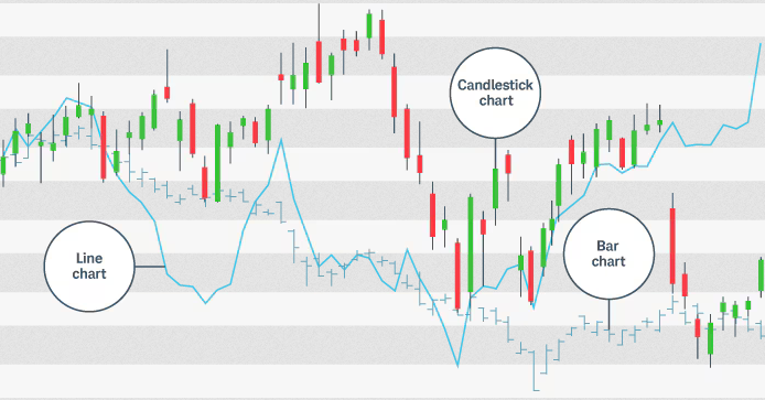
- Line Charts: The simplest type of trading chart, a line chart connects the closing prices over a set period with a continuous line. It’s great for a quick overview of the trend but doesn’t provide much detail about intraday price movements.
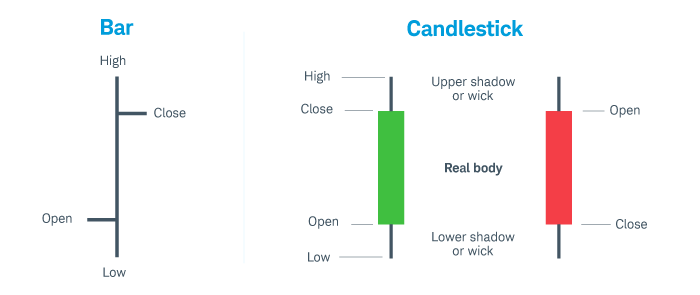
- Bar Charts: Bar charts offer more detailed information by showing the open, high, low, and close (OHLC) prices for each time period. Each bar represents a specific time frame and shows a vertical line with horizontal dashes on either side, indicating the opening and closing prices.
- Candlestick Charts: Candlestick charts are the most popular among traders because they’re both informative and easy to read. Like bar charts, they show the OHLC prices, but they do so in a way that makes it easier to identify patterns and trends. The body of each candlestick represents the range between the open and close prices, while the wicks (or shadows) show the high and low prices.
Bar charts vs. candlestick charts

Example: On a candlestick chart, if you see a series of green candlesticks with long lower wicks, it might suggest that buyers are stepping in whenever the price dips, potentially indicating a bullish trend.
Stock Chart Patterns for Traders: Spotting Trends, Support, and Resistance
One of the most valuable aspects of trading charts is their ability to reveal stock chart patterns that can signal future price movements. Here are a few key patterns to watch for:
- Head and Shoulders: This pattern is often a sign of a trend reversal. It features three peaks, with the middle one (the head) being higher than the other two (the shoulders). If the price breaks below the neckline after forming this pattern, it could signal a shift from a bullish to a bearish trend.
- Double Top and Double Bottom: A double top is a bearish reversal pattern that occurs when the price hits a high point twice and fails to break through, indicating a potential downturn. Conversely, a double bottom is a bullish reversal pattern where the price hits a low point twice before reversing upward.
- Triangles (Ascending, Descending, Symmetrical): Triangles form when the price moves within a converging range. An ascending triangle often signals a potential breakout to the upside, while a descending triangle might indicate a breakout to the downside. A symmetrical triangle can break out in either direction.
Example: If you spot a descending triangle pattern forming on an Ethereum (ETH) chart, it could suggest that the price is likely to break out downward, signaling a potential selling opportunity.
How to Read Trading Charts
Reading trading charts might seem complicated at first, but it’s all about understanding the basic components and what they mean. Start by selecting the time frame you want to analyze—this could be anything from 1 hour to 1 week, depending on your trading strategy. Next, focus on the key price points: open, high, low, and close.
After that, look for patterns or trends, like the direction of the moving averages or the shape of the candlesticks. To get a clearer picture of the market’s momentum and potential future movements, you can also use trading indicators such as RSI (Relative Strength Index) or MACD (Moving Average Convergence Divergence).
Example: If you’re analyzing a Bitcoin (BTC) chart and notice that the price is forming higher highs and higher lows while staying above the 50-day moving average, this suggests a strong uptrend, and you might consider a buying opportunity.
Benefits of Reading Trading Charts
Learning how to read trading charts offers several key benefits:
- Informed Decision-Making: By analyzing price movements and trends, you can make more informed decisions about when to enter or exit a trade.
- Identifying Opportunities: Charts help you spot potential trading opportunities, such as breakouts or reversals, before they happen.
- Risk Management: By identifying support and resistance levels, you can set more effective stop-loss orders, helping to manage your risk.
Example: If you identify a strong resistance level on a Litecoin (LTC) chart, you might decide to set a stop-loss order just below it to protect your investment in case the price reverses.
How to Identify Trends on Charts
Identifying trends on trading charts is crucial for successful trading. A trend is simply the overall direction in which the market is moving—upwards, downwards, or sideways. Here’s how to spot them:
- Uptrend: Characterized by higher highs and higher lows. If the price is consistently making these moves, it indicates that the market is in an uptrend.
- Downtrend: Characterized by lower highs and lower lows. If the price is consistently moving lower, it indicates that the market is in a downtrend.
- Sideways/Range-Bound: When the price fluctuates within a horizontal range, neither making higher highs nor lower lows, it’s in a sideways trend.
Example: If you’re looking at a Dogecoin (DOGE) chart and see that the price is forming a series of higher highs and higher lows, it’s likely that DOGE is in an uptrend, signaling a possible buying opportunity.
Conclusion
Trading charts are invaluable tools for traders, providing a visual representation of market data that helps you make informed decisions. By understanding how to read and analyze different types of trading charts, spotting patterns, and identifying trends, you can greatly improve your trading strategy and increase your chances of success. Whether you’re a beginner or an experienced trader, mastering the art of reading trading charts is essential for navigating the often unpredictable world of trading.


